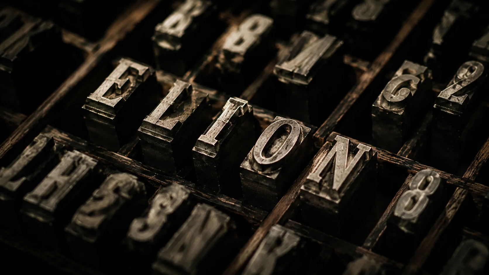
Typography is the design nobody sees (but everyone feels)
The most ignored decision in design
Most website projects arrive at the designer with a detailed brief about colors, visual references, and the brand's "feeling." The typographic choice comes last — almost as an afterthought. "You can use a modern sans-serif."
It's an expensive mistake. Typography carries more identity than any other visual decision. It defines the reading rhythm, the perceived level of formality, the personality of the brand's voice.
Why Inter is everywhere
Inter dominated the web because it's neutral, legible, free, and works in any context. It's the typographic equivalent of rice: goes with everything, protagonizes nothing. For products that need strong identity, it's too safe a choice to be right.
In 2026, expressive typography returned as a differentiator. Fonts with personality, bold display + mono combinations, typographic hierarchies as a design element, not just a reading tool.
What typography communicates before the words
A serif font says "I have history, trust me." A mono font says "I'm technical, I'm precise." A display sans-serif with generous tracking says "I'm premium, I live for detail." These perceptions happen in milliseconds, before conscious reading.
The brand that chooses typography by default (or by cost) is also communicating something by default. Usually: the absence of positioning.
It's not about complexity
The best typographic systems are simple: one strong display font, one legible body font, a third mono for data and code when needed. The complexity lies in choosing those three — not in the quantity.
Well-chosen typography doesn't appear in the designer's portfolio. It appears in the quality perception the client has without being able to explain why.