The end of the generic interface
Visual saturation has arrived
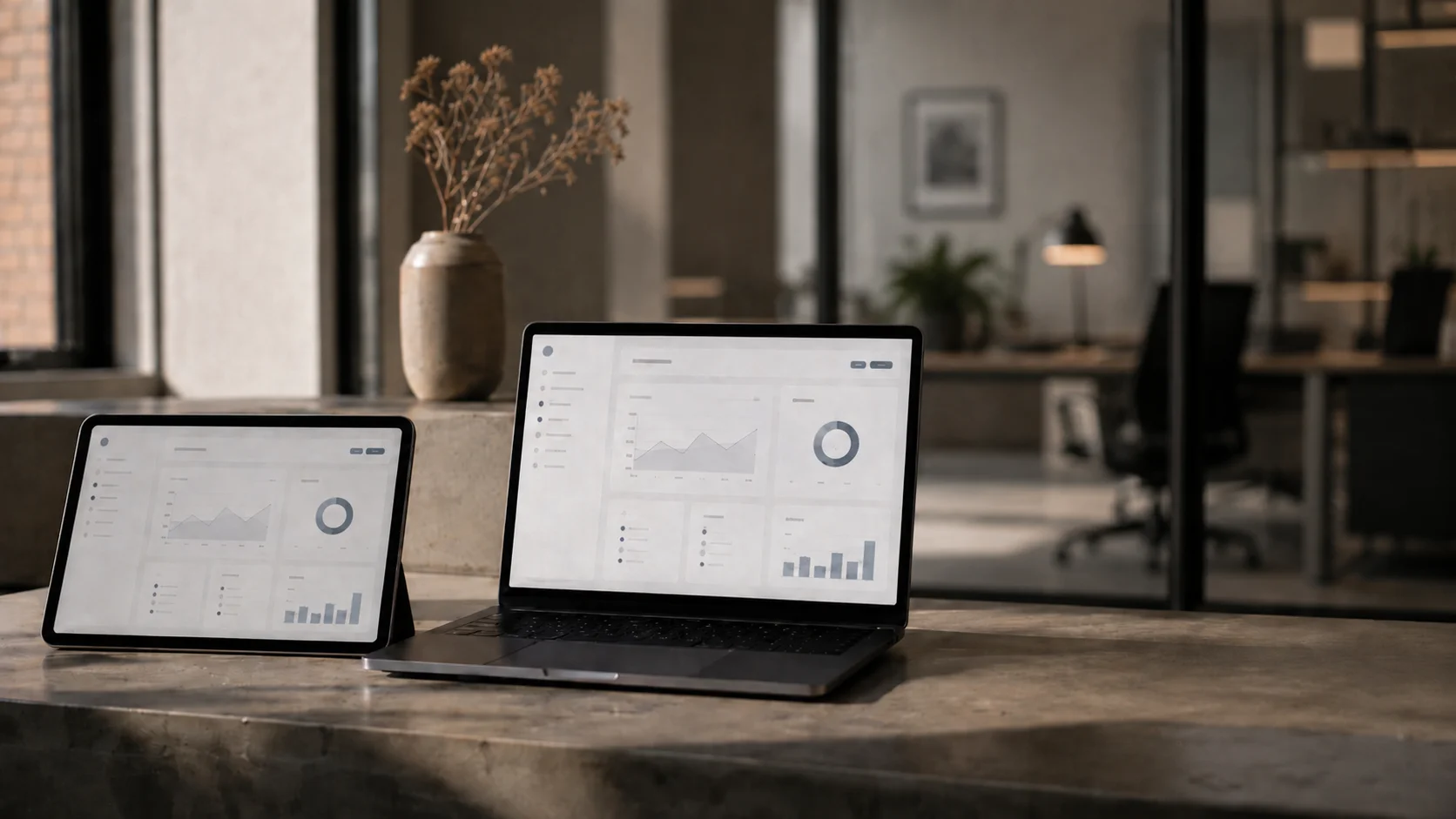
In 2026, opening any SaaS dashboard is like walking into a supermarket: everything is organized, clean, and completely devoid of personality. Pastel gradient background, friendly sans-serif font, rounded icons, cards with soft shadows. Functional. Predictable. Forgettable.
The problem isn't aesthetic. It's strategic. When everything looks the same, no product stands out in the user's memory. And what isn't remembered isn't recommended.
Why this happened
Standardization came from efficiency: robust design systems like Material Design and Ant Design sped up delivery and reduced errors. But along with them went identity and creative risk. The market filled up with well-built products that are completely soulless.
Designers stopped making choices. They started following components. There's a difference.
What's changing
The products growing in 2026 share something in common: deliberate visual boldness. Not chaos — architecture with attitude. Typography that breathes, grid as a foreground element, animation that explains rather than decorates.
Linear uses aggressive negative space and mono typography as language. Vercel has a palette that intentionally looks like a programmer's terminal. Resend bet on absolute black and white when everyone else was using blue.
None of them have a "beautiful" design in the conventional sense. All of them have a voice.
What this means for your product
Before opening Figma, there's a more important question: what is your product's personality? If you can't answer in one sentence, the design will be generic by default.
The generic interface isn't an execution problem. It's a positioning problem that manifests visually.